Appearance
Visualisations
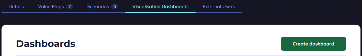
Dashboards
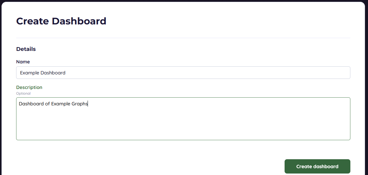
Organise graphs. Create new or edit existing
Charts
Add charts to dashboards
Chart Details
- Chart Title.
- Chart Type: Bar, Horizontal Bar, Line, Doughnut.
- Time Base Selection: Daily (Line), Monthly (Line, Bar, Horizontal Bar) , Yearly (Line, Bar, Horizontal Bar, Doughnut).
- Layout:
- Enable Legend: Interactive legend, hide/unhide series.
- Enable Stacking: Series stacked in order added. Multiple Stacks: Series stacked only with others in same stack (3 stacks available).
- Chart Series: Add, edit, remove series.
- Name: Label in Legend.
- Scenario: Source Scenario.
Adding Data / Chart Series
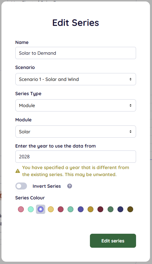
Series Type: Module (total Supply to Load of module or electrical/thermal load)
Installation (total Supply to Load of Installation),
Profit & Loss Entry ,
Financial Analysis Entry (e.g., Capital Expenditure, Cash Flow, Depreciation , Earnings Before Taxation, etc. , ),
Aggregation.
- Year: Not for yearly Time Base. Year of simulation (e.g., "6" for 6th year of simulation).
- Invert Series: Multiplies series by -1.
- Series Colour: 1 of 12 colours.
- Formatting Options:
- Enable Moving Average: Only if Time Base is Daily. Applies filter. Moving Average Window is number of days either side (e.g., window of 3 gives 7-day average).
- Rounding Type: Default 3 decimal places. Can be Decimal (chosen decimal places) or Significant (chosen significant figures). Rounding Precision is number of places/figures.
- Axes Options:
- Axes Pre/Suffixes: Add to axes labels.
- Axis Titles: Add X & Y axes titles.